Blogging tips

"People ignores design that ignores people"

" People ignores design that ignores people"
Frank Chimero
Showing posts with label harmony. Show all posts

Sunday, 2 March 2014

Nineteen bathrooms with soul

Beauty of interiors  


      Sometimes we don´t even know what are we talking about. We just know we like it.

     This I exactly what I mean:

beau·ty  (byo̅o̅′tē)
     n. pl. beau·ties
1. The quality that gives pleasure to the mind or senses and is associated with such properties as harmony of form or color, excellence of artistry, truthfulness, and originality.

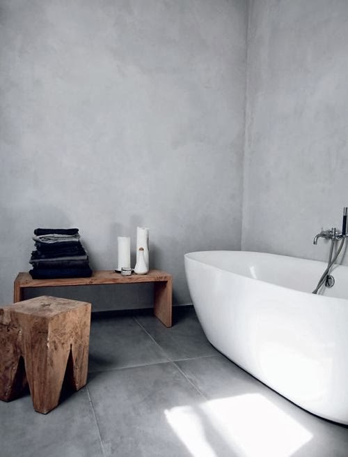
When we think about beauty not many of us are thinking about a bathroom...but even that space can be charming. Like the following bathrooms.
Beauty can be something very relative. Your idea of beauty can be opposite to mine and even though all following bathrooms are very different between, they have only one thing in common: We can call it beauty, we can call it soul.


(via Hidden Hotel)

(via fjellby)


(via bluesphere)


(via nu)


(via pinterest)

 (via tumblre)


(via lakejane)

(via laluna)

(via cocokelley)


I hope you enjoyed.
Which one is your favorite?


Tuesday, 25 February 2014

La vie en rose!

Color Code:   *Pink  *Grey  *Black   *white

   Normally, I tend to go for a neutral palette, as I find myself more comfortable in a total white interior with some wooden touch, but...
Doesn't it make a perfect match?
   *Pale pink color is giving the romantic side, the sweetest, the warm, the calm, peace and lovely side of the balance. 
   *Black color is giving just the opposite one: dusk, gloomy, shadowy and mainly loads of contrast. Low doses of it equilibrates the sickly sweet of pink color.
   *And grey is just calming down, giving the harmony to the aggressive relationship between both of them.
   *White just needs to be there...

                                    * * *

   Confieso que, por norma general, tiende a gustarme una paleta de colores muy neutra, ya que me siento mucho más cómoda en los interiores total White a los que la madera aporta ese toque de calidez que el color blanco necesita para no resultar frío, pero...
¿Y esta paleta no forma un combo perfecto?
   *El rosita palo aporta romanticismo, dulzura, calidez, calma, paz y muestra el lado más encantador de la balanza.
   *El negro aporta justo lo contrario: oscuridad, pesimismo, sombra y, principalmente, mucho contraste. En bajas dosis equilibra lo empalagoso del rosa.
   *Y el gris lo calma todo, proporciona la armonía a la agresiva relación entre ambos.
   *Por último, el blanco: tiene que estar...


Enjoy!


Get the look with acapulco chair. You can find it available in pink, grey, white and black color (and much more!). To find it online just click on here.


Related Posts Plugin for WordPress, Blogger...